Making Life Insurance Easy
- Stef Donovan
- Sep 8, 2019
- 5 min read
Updated: Mar 31, 2022

Challenge
Although 60% of Canadian households are paying into a life insurance policy, some financial experts believe that most Canadians are still underinsured. Our business created a calculator that's purpose is to inform Canadians of their family's financial needs if they were to pass away. I was tasked with helping to improve the usability of an existing calculator and to help emphasize the value of life insurance to users.
Project background
This life insurance calculator is used by customers to estimate the amount of financial coverage their loved ones may need in the event of their untimely death. The goals of the business were to show the value of additional life insurance and connect these customers with a financial advisor to discuss their financial needs.
Skills used
Consultation
Usability Research
Wireframing
Prototyping
Testing
Tools used
Sketch
Craft
Invision
Zeplin
Abstract
Research and strategy

My research was done in two phases and involved both discovery and behavioural methods. During the first phase, I consulted with the business stakeholders and the internal UX team to get a better understanding of the problem space, the product (life insurance), and our assumptions about our users and their behaviours.
In the second phase, I extensively researched and documented common calculator patterns, best practices for form design, and examples to draw inspiration from. I put emphasis on providing quality research and best practices, as the UI elements that I created would be reused in our design system.
Information architecture
Before starting to implement new designs, I looked at how the existing functionality of the calculator works and analyzed the current flow of information. I noticed that as the user filled out the calculator fields, micro-calculations were being made to calculate the user's final results.
Existing calculator design
Problematic
The wireframes provided to me were desktop designs and were created in an unfamiliar program. I believe in designing mobile-first in order to optimize the user experience for visitors coming from a variety of screen sizes, so I researched mobile-friendly design patterns to work with.
First Steps
I needed a way of moving information around and ensuring that the current architecture made sense, so I re-created the other designer's wireframes in Sketch to start.


Information architecture
From here, I started to think about laying out the components in a logical way to show users the calculations they are making, and what that means to them.


Google Material's single expansion panel UI
The following information was sourced from: https://material-ui.com/demos/expansion-panels/
Basic expansion panel

Expansion panel as accordion

Expansion-panel content
Each expansion panel must include a header and may optionally include an action bar.
Header
The <mat-expansion-panel-header> shows a summary of the panel content and acts as the control for expanding and collapsing. This header may optionally contain an <mat-panel-title> and an <mat-panel-description>, which format the content of the header to align with Material Design specifications.
By default, the expansion-panel header includes a toggle icon at the end of the header to indicate the expansion state. This icon can be hidden via the hideToggle property.
Accordion
Multiple expansion panels can be combined into an accordion. The multi="true" input allows the expansions states to be set independently of each other. When multi="false" (default) just one panel can be expanded at a given time:
Iteration #1
Design
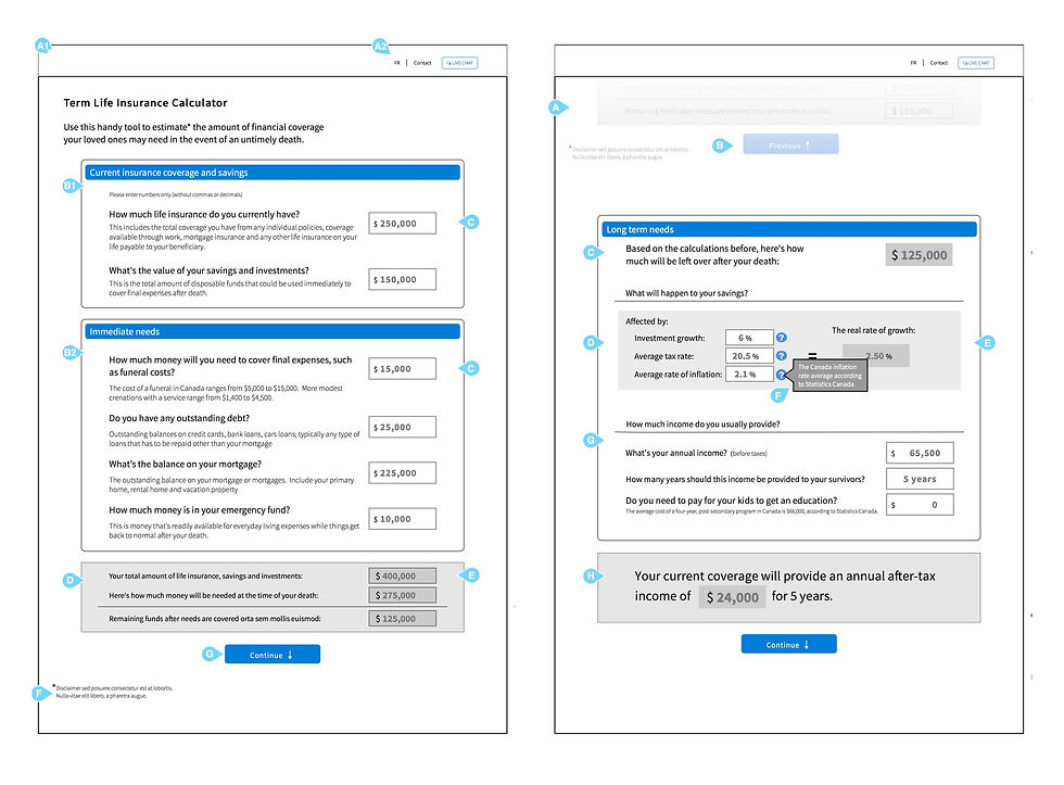
I felt that the existing design didn't give motivate users to get them to continue filling out the form, and it didn't communicate the meaning behind the numbers we are asking users to enter. In order to communicate how much life insurance a family would need to cover the user's debts if they were to pass away, I decided to provide purpose behind the several small calculations and bring attention to the meaning behind the inputs we are asking users to enter.
I designed several small calculations to bring attention to all of the user's funds. The calculations build off one another, which created a unique problem because these calculations must carry from the end of one step to the beginning of another.
In order to show the user the big picture (how much life insurance they need), I used Google Material's expansion panels to break up the content and tell the story. Every expansion panel contains user inputs and a review of the values users have inputted. When the expansion panels are stacked together they can be used as an accordion panel for users to go back and review or edit previous inputs.
Iteration #1 Wire-framing
I decided to start creating my wireframes mobile-first so that the design would scale well across different screen sizes. I tried out the aforementioned Google expansion panel component.

Prototyping
One of the best ways to test a design and to see if it will work for your consumer is to make a prototype. I used Invision's Craft plugin with Sketch to link several screens together, and then uploaded my designs to Invision so I could test the flow and feel.
Testing
There are a few things I was looking for when testing: usability, accessibility, errors, and confusion. Although this project didn’t have funding for external testing, I had a few of my co-workers try it out.
Results
After having a few people go through the calculation process, I discovered that my placement of where the results were located was a little confusing to the user, and was often being skimmed or skipped over.
From user testing, I knew that I needed to find a way to slow the user down to read their results. I was unsure if introducing more steps with reduced content would result in higher drop-off rates or would slow down the user enough to read the content so I consulted with another designer. We decided it was best to explore this option and to test it.
Iteration #2
Wire-framing
This time around I decided to slow the users down. I did this by separating the results and the summary call to action by creating a fifth step for the users. This allowed users to slow down and read the content, and it prioritized our call to action - to get a quote.

Prototyping
I used the Craft plugin by Invision again to link the screens and upload them to a low-fidelity prototype to have users test.
Testing
I was looking during user testing to collect any data or insights on the usability, accessibility, errors, and confusion users might have. I had new coworkers try out the second iteration of this design.
Results
After having 10 people go through the calculation process, I discovered that fewer users were confused and we had a completion rate increase of 40%. Although we didn't have a 100% completion (success) rate for this test, resourcing was time constrained so the second iteration was what I delivered.
Final Designs

Mobile Design
This is a prototype I made in Invision of the mobile wireframes. As seen in the GIF, the user simply fills out their information we ask for and can re-visit it or edit by opening up the expansion panels.

Desktop Design
Below is an Invision prototype walkthrough of the process a user would take to complete the Term Life Insurance Calculator.
Next Steps
During this project, I learned a lot about how to break down complicated business calculations to make them simple to understand for the user. It proves to be difficult to communicate financial terminology to everyday users, and this project was an example of how I was able to overcome some of those challenges to more clearly communicate a financial need.
Going forward if I were to make this calculator again, I would explore other options outside of Google's expansion panel for the form pattern. I think that there may be more simple designs out there that users are more familiar with. I would also want to test the terminology, design, and understanding with real end-users so I could capture and implement better feedback.


Comments